
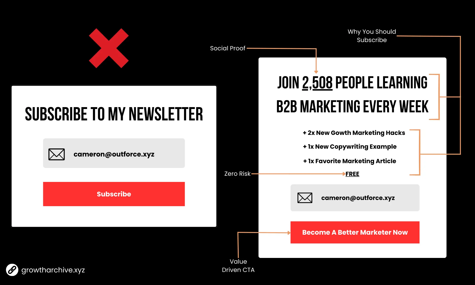
Creating a successful newsletter landing page means crafting a clear, enticing experience that gives visitors exactly what they need to feel confident subscribing. Here are four powerful strategies to ensure your landing page converts and builds a loyal subscriber base.
Your headline is one of the most critical parts of your landing page, and adding social proof to it can make a significant impact. Social proof – like subscriber numbers, testimonials, or endorsements – shows visitors that others already find value in your newsletter. This reassures them that your content is worth their time and inbox space.
- Examples of Social-Proof-Enhanced Headlines:
- “Join Over 5,000 Readers Who Discover the Best Indie Newsletters Weekly”
- “Trusted by 10,000+ Content Lovers – Get Curated Recommendations Straight to Your Inbox”
Including social proof directly in your headline can immediately communicate that your newsletter is trusted and well-regarded, which makes new visitors more likely to join.
 Credited image to growtharchive.xyz
After capturing attention with your title, give visitors a clear idea of what your newsletter delivers. Be specific and focus on the unique, high-value content they’ll receive each week. This clarity helps them visualize the benefits and builds excitement for subscribing.
- Effective Content Lists:
- Curated industry insights, tools, and resources they won’t find elsewhere.
- Recommendations for indie newsletters, curated to match their interests.
- Early access to exclusive content or interviews, tips, and updates.
Make sure this content list is simple to scan, preferably in bullet points or brief descriptions. This way, potential subscribers can quickly understand the value of each issue and how it aligns with their interests.
Reassure visitors that there’s no risk in subscribing by highlighting a few key points that ease common concerns. You might let them know they can unsubscribe at any time or emphasize your commitment to keeping their inbox clutter-free. Providing this information upfront shows respect for their time and helps reduce hesitation.
- Zero-Risk Phrases to Include:
- “Unsubscribe anytime with a single click – no hassle, no questions.”
- “We value your privacy and never share your email address.”
- “Only one email per week – no spam, just valuable insights.”
Addressing these concerns reduces the “commitment barrier” and lets visitors feel comfortable subscribing, knowing they’re in control.
Your call-to-action (CTA) button is where visitors make the final decision to subscribe, so it’s essential that it conveys excitement and value. Instead of a generic “Subscribe” or “Sign Up,” use a CTA that reinforces the benefits they’ll receive by subscribing.
- Examples of Value-Driven CTAs:
- “Get Weekly Curated Content Now”
- “Join Free and Start Discovering New Reads”
- “Unlock Your Personalized Recommendations”
When your CTA reflects the value of your newsletter, it gives potential subscribers a compelling reason to click, completing the journey from visitor to subscriber.
Here’s a simple structure using the points above to create an optimized, high-converting newsletter landing page:
- Headline with Social Proof: “Join Over 10,000 Readers Who Get Weekly Curated Newsletter Recommendations”
- Content List: Brief bullet points of what subscribers can expect (e.g., “Handpicked indie newsletters,” “Exclusive content,” “Time-saving insights”).
- Zero-Risk Reassurance: One or two lines about easy unsubscribe options and your commitment to privacy.
- CTA: Value-driven CTA button like “Get Your Weekly Recommendations” or “Start Discovering New Content Today.”
By focusing on social proof, clarity in content, zero-risk messaging, and a value-focused CTA, you’ll create a newsletter landing page that speaks directly to what visitors need to make a confident, excited decision to subscribe.